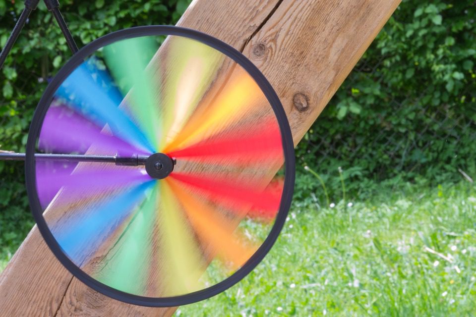
It’s tempting in design to get so mired in the functionality of a product that you neglect its aesthetics. Appearance matters, and color figures prominently into the way a product presents itself.

(Pixabay / fotoblend)
Color helps get people’s attention and plays a prominent role in people’s first impressions of a product. In fact, a recent study showed that 90 percent of initial judgments are formed based solely on a product or brand’s color. Color should not be merely an afterthought in the product development process.
Color is tricky to get a handle on. Different colors mean different things to different people based on their experiences and interpretations of the world around them. A person may be obsessed with a certain color one day, then quickly fall out of love with it the next. People’s color preferences are often based on fleeting emotions that are hard to understand or pin down. There is actually a whole field of study called color psychology that is devoted to people’s feelings about color.
Even though there’s significant variation in the way that people view color, there are some qualities that are consistently associated with different hues. These include:
- Red – Associated qualities: Love, passion, danger
- Yellow – Associated qualities: Happiness, positivity (though it can be associated with impulsivity)
- Green – Associated qualities: Peace, tranquility
- Blue – Associated qualities: Peace, tranquility (same as green)
The most important factor in choosing your colors is to consider your target audience. Are they young or mature? Expressive or understated? Calm or adventurous? Once you have decided on a primary color, select a color palette with complementary hues.
Keep your palette modest—more than three or four colors could overwhelm your audience.
